We’ve looked at red, grey, black and yellow flooring over the past few weeks, so it seems only natural to look at the effect of using all, or some of these colours together.
To do this, we have gathered some examples from a variety of market sectors to see how and why colour has been used, starting with these colourful car parks.
While many of us will be used to your standard grey car parks with white demarcation, there are some areas of the world where this colour scheme doesn’t quite cut it.
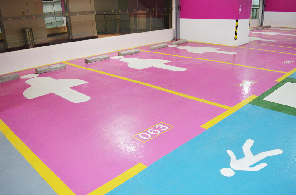
Pink, blue, yellow, white, green, purple and grey were used in this multicoloured car park
Take the car park above for example. Based in Asia, this car park features women-only parking bays that are identified by a bright pink deck coating system. With green walkways, purple car pool bays and a grey main concourse, we imagine that this car park is a sight for sore eyes!
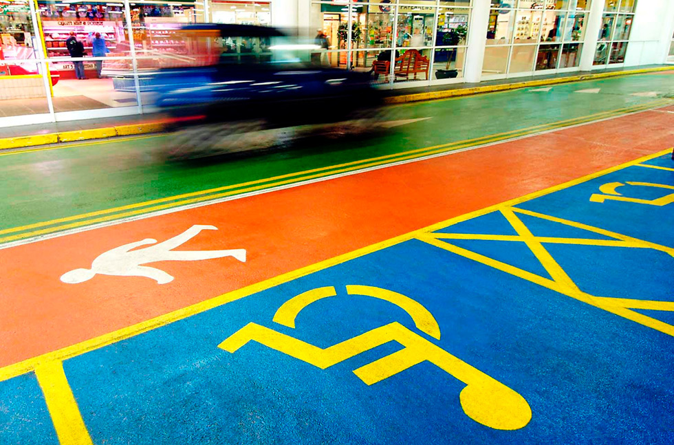
Deeper shades of blue, red, green, yellow and white were used in this outdoor car park
It is not just indoor car parks that can utilise colour however. This outdoor car park in the UK has used green for the main concourse, red for safe walkways, blue for disabled bays and yellow demarcation. Purple was also used here for parent and children bays, which also reflected the branding of the store at the time.
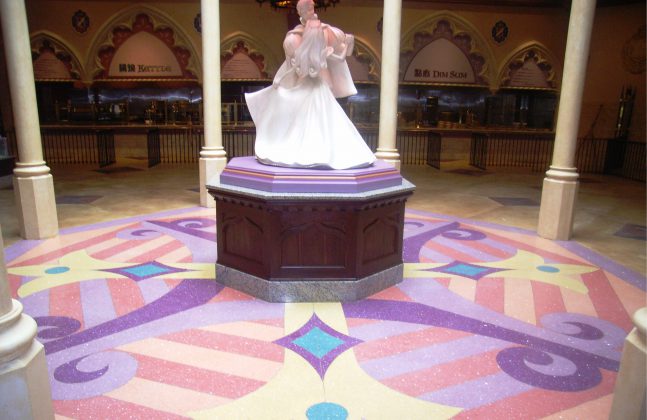
Purple was a common theme in this multicoloured seamless terrazzo floor design in Hong Kong’s Disneyland theme park. Six different colours were used here to create the magical design.

Six different pastel shades gave a magical central point in this Disneyland eatery
We think that the muted colours used above are very reminiscent of fairy tales, which is further enhanced by the shimmering aggregates used within the terrazzo system, comprising of marble, mother of pearl and glass.
This railway station also required a colourful and hard wearing flooring system to replace old, cracked floor tiles, and decided to embrace the sprawling space and create one of the largest pieces of public artwork in Australia!
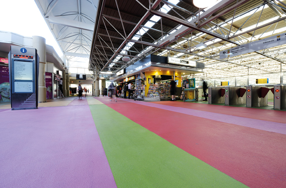
Mutlicolored stripes in this train station became one of the largest piece of public artwork in Australia
The vibrant colours were chosen to represent the station’s interconnected network of tracks, cables and lights – we love the contrasting colours here!
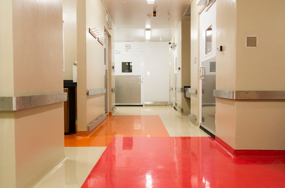
Bright red and orange custom colours were created for this healthcare centre
If you’ve seen our post on flooring solutions for healthcare environments, you’ll know that a blend of resilience, durability and attractiveness is required for the flooring, to help keep patients safe and feeling calm and welcome.
For the medical institute shown above, the requirements were no different. In fact, the architect required such specific colours that they showed swatches to the flooring specialists, and bespoke colours were created to match.
It is not just hospitals or healthcare centres that use colours to help keep a space safe. This is also often seen in industrial areas, for example safe walkways may be highlighted in a different colour to areas of moving machinery, or coloured sections may be used to show where equipment should be stored when not in use.
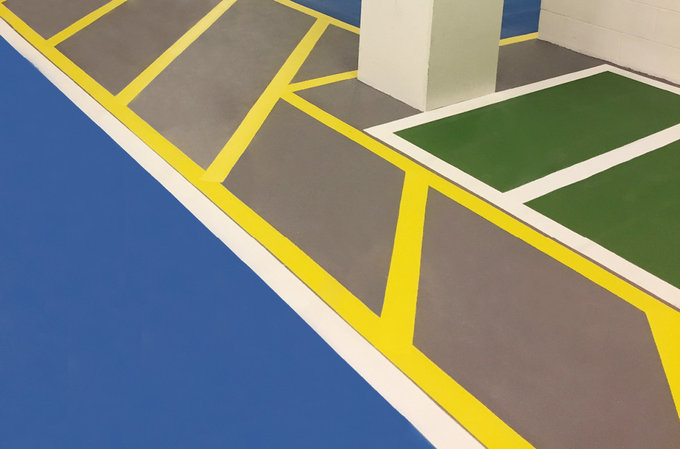
Yellow demarcation shows where items can’t be stored in this space
For the back of house area shown above, coloured deck coating systems were used to zone the space. Whilst the green and blue areas could be used to store equipment, yellow demarcation was utilised to show areas that should be kept clear at all times.
Whether you are going for visual appeal or smart segregation, colour can be used to varying effects. If you would like more information on any of the ideas outlined above, please leave a comment below.

