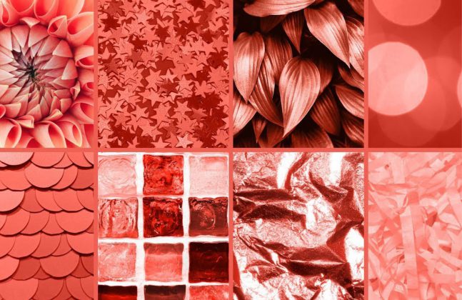
Colour can shape our mood, infiltrate our creative mind and influence our tastes. Whether you’re into monochrome or tie-dye, the colours that we surround ourselves with are often an active choice.
Each year the design world waits in anticipation for Pantone’s ‘colour of the year’, a colour that we can expect to see from the catwalk to the construction industry and from magazines to shopping malls.
As the authority of colour for the design industry, Pantone have not disappointed. Aside from a moody grey or muddy brown, this new colour could not be more different from the bright, bold Ultra Violet of 2018. In fact, this colour has been described as ‘muted’ and even a ‘pastel’ shade – but what is it?
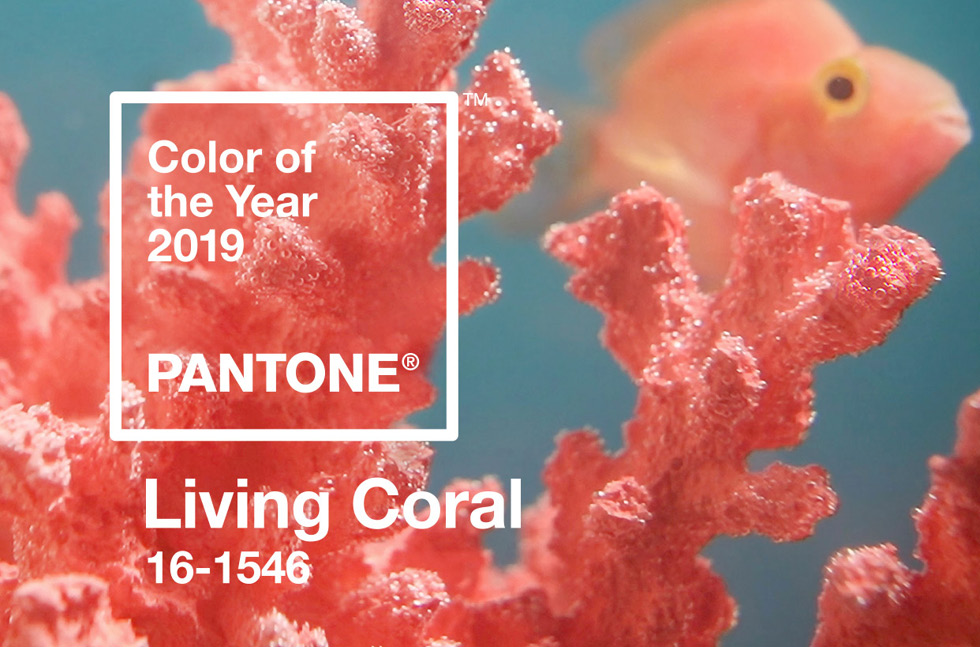
Pantone’s Living Coral is the colour of 2019
Pantone announced that Living Coral is the colour of choice for 2019. To be more exact this is Pantone 16-1546 TPX.
Naturally, we are interested in how this will shape interior design, and flooring specifically, but before we dive deeper into Living Coral, let’s recap over past ‘colours of the year’.
2015 Marsala Pantone 18-1438
Marsala is described as “a subtly seductive shade, one that draws us into its embracing warmth” – Beatrice Eiseman, Executive Director, Pantone Color Institute.
2016 Rose Quartz and Serenity
This blending of two soft shades was set to reflect reassurance and security in 2016, before the bright and bold shade for 2017 emerged.
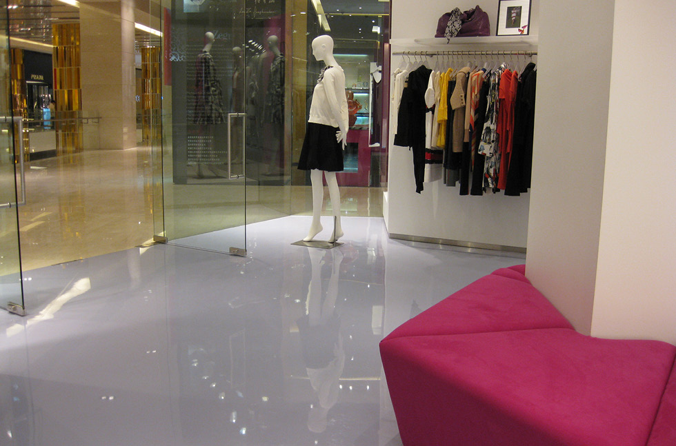
A soft pastel shade was required for this high-end retail space
2017 Greenery Pantone 15-0343
This shade of green screams fresh, clean and zesty, and it is no wonder that it is a popular choice for ultra-hygienic flooring!
2018 Ultra Violet Pantone 18-3838
This dramatic shade of purple adorned the design world for the whole of 2018, from interior design to clothing and accessories.
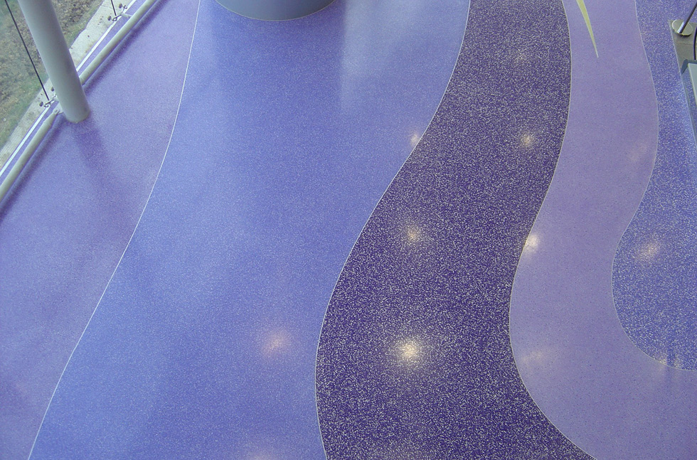
Violet hues were used in this shopping mall’s terrazzo flooring
2019 Living Coral Pantone 16-1546
This vibrant yet muted shade has been described by Leatrice Eiseman, Executive Director The Pantone Color Institute as:
“Colour is an equalising lens through which we experience our natural and digital realities and this is particularly true for Living Coral. With consumers craving human interaction and social connection, the humanising and heartening qualities displayed by the convivial Pantone Living Coral hit a responsive chord.”
With the Colour of the Year selection process requiring ‘thoughtful consideration and trend analysis’ from everything from industrial design to home furnishings, we have no doubt that we will be seeing this colour more and more over the coming months.
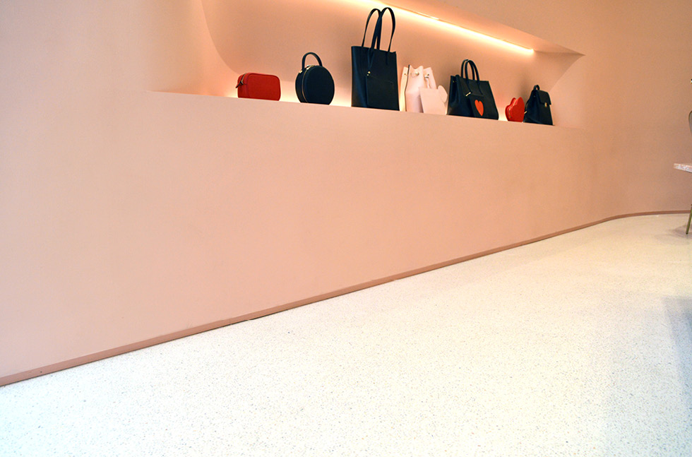
The seamless terrazzo used in this store contained Coral-esque hues to match the brand
Residing directly between orange and red, coral is a tertiary colour that is comprised of two parts red and one part yellow. Living Coral, as a species is able to flourish and grow in our oceans, but can only do so by attaching to another piece of coral. It can therefore be said to symbolise a community of global / humanitarian consciousness.
Whether you think it is more pink, salmon or peach, the adoption of this colour is an eventuality. This colour is said to encourage light-hearted activity, whilst symbolising a connection and intimacy that we search for in the digital realm.
Are you thinking of using Living Coral in your space? Try teaming it up with cool Tiffany blue for a fresh look, or warm it up with a soft yellow.

