Sight is the strongest developed sense in most human beings. Therefore it is only natural that 90% of an assessment for trying out a product is based on colour alone.
Colour can soothe your eyes, calm your mood or elevate your blood pressure. It can sway thinking, change actions and cause reactions. Before details of something are apparent, colour can often be the first thing that is seen, and so when used in designs and buildings, colour can be extremely impactful when creating a first impression.
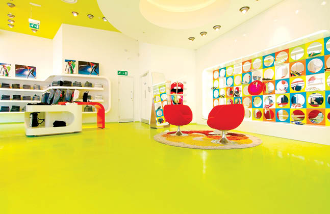
Bold colours can instantly create an impression
Flooring can offer commercial interior designers with a large space to create a bold impression. With a touch of creativity, the floor can become much more than something to walk on, but a canvas to set a mood, project brand identity or define a building’s purpose.
With innovations in technology and new design trends resulting in a wide variety of synthetic flooring materials being brought to market, vibrant coloured, high-gloss epoxy resins and decorative terrazzo were suddenly available to commercial clients.
Cool and relaxing, warm and appetising or bright and open? Choosing a colour palette can have a big impact on the mood and ambiance of any commercial design scheme. Understanding how colour can influence human behaviour and emotion is an essential part of interior design and striking a balance between hues is an important commercial decision.
Green and blue surfaces can create feelings of calm and relaxation. Green helps to reduce anxiety and gives people’s eyes some rest, which is particularly helpful in offices where employees spend the day staring at computer screens. Blue can help to reduce stress by lowering blood pressure and heart rate. Using blue in commercial spaces can increase the feeling of leisureliness and recreation.
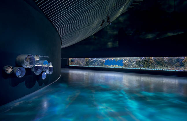
The smooth flooring in The Blue Planet, Denmark reflects the swirling water
Yellow and orange colours are associated with the sun and therefore can give a feeling of happiness and warmth. In a work place however, yellow is also the colour of caution. This is particularly true in industrial areas, such as manufacturing warehouses.
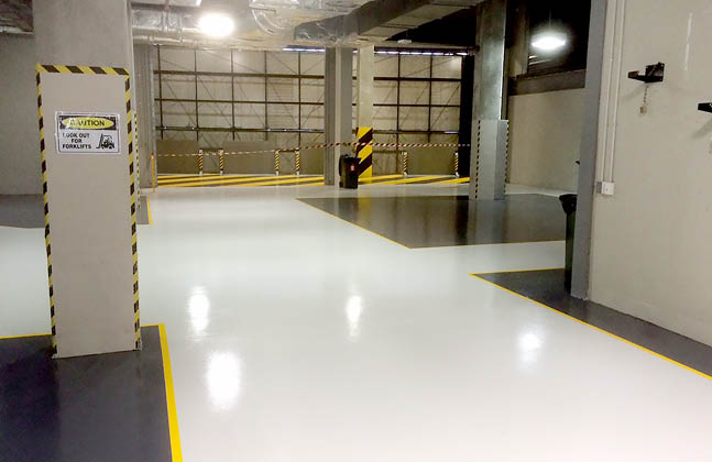
Signs of caution behind the scenes at RAC Arena
As a colour of optimism, orange inspires and motivates positive thoughts in people. With rich orange hues mirroring the colour of the Indian flag, there is no escaping the positivity at the Gandhi Memorial Park.
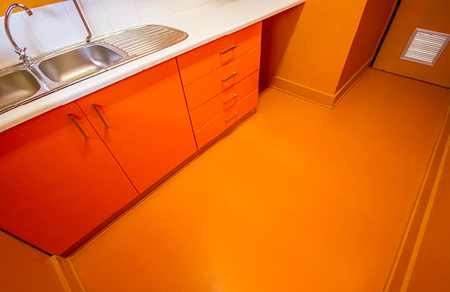
Gandhi Memorial Park reflects positivity through orange hues
As well as being voted the colour of 2018 by Pantone, purple represents the imagination. This colour is also said to expand awareness and is connected to deeper thoughts.
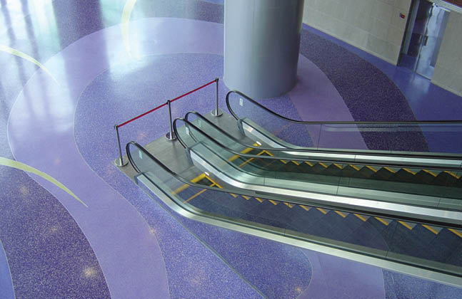
Purple hues can influence the imagination
Exploring different colour options and the aesthetics that these generate can make a space, but sometimes, the colour that is needed does not need to be out of the ordinary.
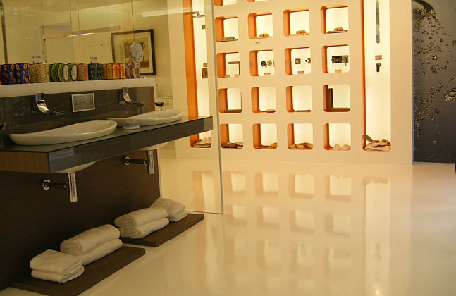
Striking white reflects calm and cleanliness at Bath House
The project above for Bath House needed a striking, bold and bright white flooring to generate a very clean visual. This calm and clean aesthetic mirrors everything that a bath should be!
We’d love to hear what you think about using more colour in your designs. Which colour would you choose?


