When Pantone reveals its annual ‘colour of the year’, the design world is never far behind…
Before you know it, that shade is adorning the catwalk, gracing the cover of glossy magazines and finding its way onto the high street before worming its way into our hearts, homes and wardrobes.
When it comes to colour, Pantone is the messiah and adoption is a certain eventuality.
More than that, Laurie Pressman, vice-president of the Pantone Colour Institute, suggests:
“The Pantone colour of the year has come to mean so much more than ‘what’s trending’ in the world of design; it’s truly a reflection of what’s needed in our world today.”
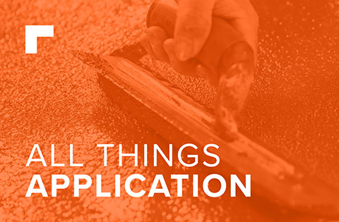
The Colour of 2018…
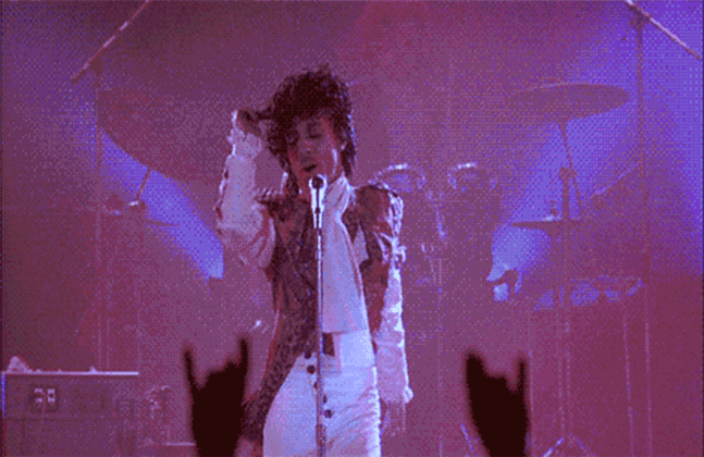
“I only wanted one time to see you laughing, I only wanted to see you laughing in the purple rain” Prince
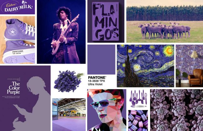
In December 2017, Pantone made its announcement that the official colour for 2018 was Ultra Violet. Or rather, for the designers among us that would be Pantone 18-3838, RGB 95/75/139 or HEX 5F4B8B.
A rich, blue-toned purple that Pantone itself describes as “a spiritual, cosmic hue” and “a dramatically provocative and thoughtful shade”. Powerful words.
Purple combines the calm stability of blue and the fierce energy of red. A rare occurrence in nature, it is amongst the most sacred shades on the colour wheel.
The colour is often associated with royalty, nobility, luxury, power and ambition. Historically, dating back as far as early Egyptian civilization, purple dyes were so expensive to attain that only kings and emperors could afford to commission their use.
As such, purple also represents wealth, extravagance, creativity, wisdom, dignity, grandeur, devotion, peace, pride, mystery, independence, and magic.
Why Purple?
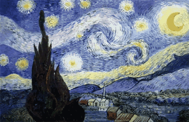
“Starry, starry night, flaming flowers that brightly blaze, swirling clouds in violet haze” Don McLean
Pantone claims the deep purple shade was chosen to evoke,
“A counterculture flair, a grab for originality, ingenuity and visionary thinking.”
Through the kaleidoscope, 2018 is all about challenging power. It’s about being bold and strong, and being truly original.
Purple has long since been associated with visionary thinking. Early Impressionist painters experimented with colours on the cool side of the palette to create shadows, represent mood and most famously to adorn that starry starry night.
In popular culture, purple is a strong influencer. It was the torment in the Prince classic ‘Purple Rain’, the backdrop for the ground-breaking Spielberg movie ‘The Color Purple’ based on the Alice Walker novel of the same name and the colour of rich, smooth, velvety Cadbury’s milk chocolate all year round.
In an interior setting, purple serves as a rich and refined accent colour, breathing imperialism and originality into any setting, whether used on walls, floors or fabrics.
If the colour purple is to set the trend for the year ahead, we are certainly in for an exciting ride.